Weapon Indicators
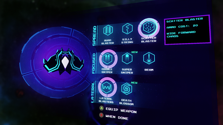
It’s very common for players to overlook the ability to change weapons on their ship because they don’t understand that a new weapon is available, they forgot one was unlocked, or they don’t understand how to equip a weapon. I’ve made changes to the user interface to help with these and I feel like this tiny bit of polish adds a lot clarity and quality to the game.
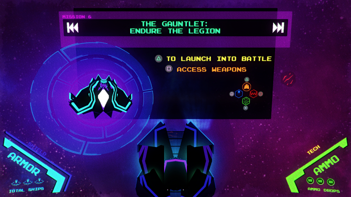
- When you dock between battles and a new weapon is available, the Dashboard screen will show you a NEW indicator next to the Access Weapons option.
- On the Weapon Select screen, each weapon will show a NEW indicator next to it until you have equipped it and taken it into battle at least once.
- Last update, I redesigned the equipped weapon marker to be larger, but this time I’ve made it much brighter and bolder and also pushed it behind weapon icons and the selection cursor.
Hiding HUD
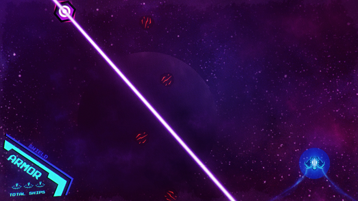
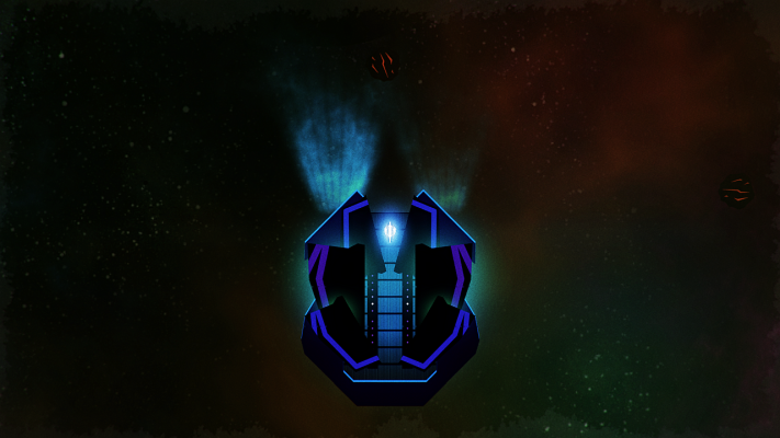
Have you ever played a game and lost sight of your own character? This is a frustration game designers should work hard to avoid. In REVO, I have seen people hide their ship behind the HUD interface elements in the corners of the screen and get confused.
To avoid this problem, the HUD will now disappear if you try to move a ship behind it, and only in the corner where you place the ship. I think this solves the problem nicely, but please let me know what you think.
PlayStation Controls
PlayStation controllers are not uncommon among players of REVO. Unfortunately, at least a couple people reported the game did not respond properly to these, despite the fact that at least one person’s worked fine.
To help broaden compatibility, I have configured the game to watch for PlayStation controllers, so theoretically this will help. Unfortunately, I cannot test this myself because I do not have a PlayStation controller, so please give it a shot and let me know if it worked or not.
Cinematic Tweaks
Two things didn’t feel quite right about the new intro sequence, so I tweaked it a little to tighten up and refine the experience. The start of the intro now triggers a change in music to shift the tone. I’ve shaved off a hefty 10 seconds of animation time. Hopefully, after you’ve seen it several times, it won’t feel quite as old. More cinematic moments are planned, so stay tuned.
Bug Fix
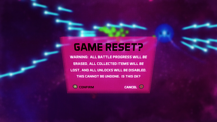
While several bugs remain in game, I’ve fixed the one that used to hide the Game Reset Confirmation window. This only happened from the pause screen and then Options screen, so you may have never seen it yourself. Either way, one less broken thing is good news.
Browse the REVO Change Log for details on remaining known bugs and other change details.
Try For Yourself
I’d love some feedback on these refinements. Sign up, play it, and tell me what works for you and what needs more work. This will really help!
