Weapon Select
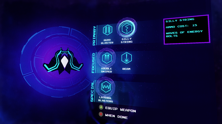
I noticed some confusion when players would open the Weapon Select screen to view newly unlocked weapons. Sometimes they would seem to want to use new weapons but fail to actually equip them.
Perhaps the subtlety of the graphics that mark which weapons are actively equipped is the cause. The cursor used to hover over a weapon for more information is clear but the equipped status was just a thin dotted outline.
What I did was redesign the marker graphic to help it stand out. It is now a thick ring of color. This definitely stands out better, although it is a little too faded, so I’m going to work on it some more in the next update.
Dashboard Upgrade
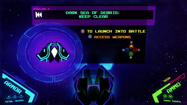
Part of the transition into a more complete game will include an opening sequence that involves the first reveal of the ship’s combat system and I think the large ship preview graphic found on the Weapon Select screen will be central to communicate this.
I love the closeup view of the player’s ship that has appeared in game for some time now. It’s just fun to look at, although you haven’t been able to fully appreciate it if you rarely or never change your weapon selections.
I’ve extracted the ship preview from the Weapon Select screen and have it display alongside both the main Dashboard and the Weapon screen. It now appears every time you’re docked with the support ship so all players will enjoy it between every battle.
I’ve also added a preview of the actively selected weapons onto the Dashboard so you can see what they are even without opening the Weapon screen. This is the same diamond layout of icons found on the Combat Menu pause screen.
This is all a work in progress, so the Dashboard will continue to get lots of love, but as a first quick set of alterations, I think it’s off to a great start.
HUD Reveal
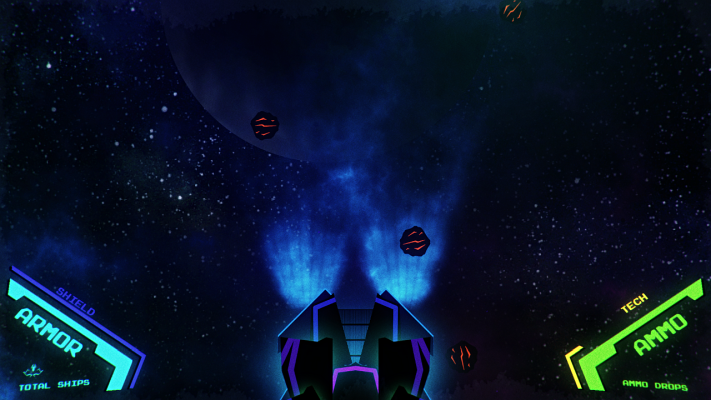
In the last update, the HUD-free cinematic led to an overwhelming reveal of the full Dashboard and HUD interfaces all at once. This is just way too many things to present to a new player in a single split second.
To stagger the introduction of new information, the HUD now appears after the cinematic intro but before the Dashboard comes into view. I hope this will relax the experience for new players. It also just has a better rhythm.
Ending Fixed!
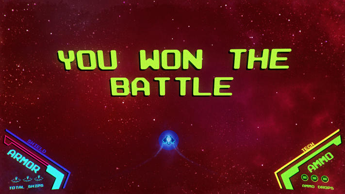
Last update, I broke the game. The ending wouldn’t trigger. If you don’t get that far, fine, but someone will, so this was a priority item to fix.
Fortunately, it turned out that the cause was quick to spot and easy to fix. The recent change to heavy enemy gunship behavior left them perpetually “in battle” even if you couldn’t see them, and this prevented the game from moving forward.
I’ve configured the final boss escort ships to behave as they used to and additionally modified the Slayer Drone behavior in an earlier boss battle to have them flee when their mothership is destroyed.
Delays and especially full on stops after boss battles are now fixed across the game. Everything should step forward properly once again.
Try REVO!
Why not see all of these updates first hand with a free early version of the game. You can play it yourself and offer me some helpful feedback afterward.
