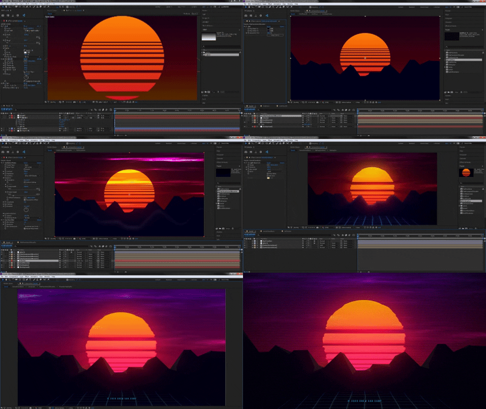
This one was a little tougher than the last design. Needed more than one round to get it right. First day I created the general shape, layout, and a rough idea for colors. However, it just wasn’t interesting enough to place on even my own desktop. So I got feedback from a friend and put it away for a day or so.

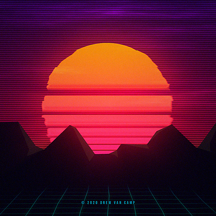
I was pretty sure it needed more colors and it generally felt a little flat. So I pushed blues into the sky, which brought out hot pink and purple. I calmed the blues down in the landscape and painstakingly added some depth to the mountain range. Scanlines in the sky were on a whim, as was the accidental discovery of a denser looking sun disc.
What I love about the result is the wide range of colors, the depth of sun and mountains, the simple use of scanlines and heat distortion… Let’s just say I love all of it. lol
So here you go, I’m happy to share it. Enjoy your own copy.
Thanks for visiting! And check out my neon music while you’re here.
